*disclaimer* there is no perfect Instagram grid, everyone has their own unique theme…
So before I start, this post isn’t based solely on my own Instagram grid, mine is BY FAR from perfect, I look at it all the time and wish it looked different. I’m not even an Insta expert, I’m doing absolutely crap on it lately, my engagement levels are awful compared to my follower count. Anyway, I’ve created this post with these tips based solely on the Instagram grids that everyone loves, the ones that I think are bloody gorgeous and the ones that get a lot of engagement. I have a love/hate relationship with Insta themes, I try and make mine fit in with a theme but every week it will look completely different. I also hate not posting photos just because they won’t fit in. For example; if I take a super adorable photo of Reuben, I don’t want to not post it just because the background isn’t all white and perfect and there’s not enough pink in the picture, you know?!
I know that everyone is obsessed with insta themes, whether we like it or not, we all are. I also know that a lot of people try to not let it bother them so that they can post what they want, and I know that others swear by their theme and don’t post anything that won’t fit in with it. I mean lets be honest, we all go on people’s profiles and follow them based on their theme don’t we? But once you’ve followed that person, how often do you go on their page and look at their theme? For me, there’s only a handful of people who I actually stalk just to look at their grids. Everyone else I follow, I just see their pictures in my feed so whether it goes with their ‘theme’ or not is irrelevant. This is what I try and think about when I’m getting too obsessed with how imperfect mine looks.
ANYWAY. To put it simply, there is no perfect Instagram grid. I follow such a wide variety of accounts and every single one is different. However, I will give you some tips on how to curate yours so that once you’ve found a style that suits you, you can have that ideal theme that you oh so want.
Instagram Grid: Colour
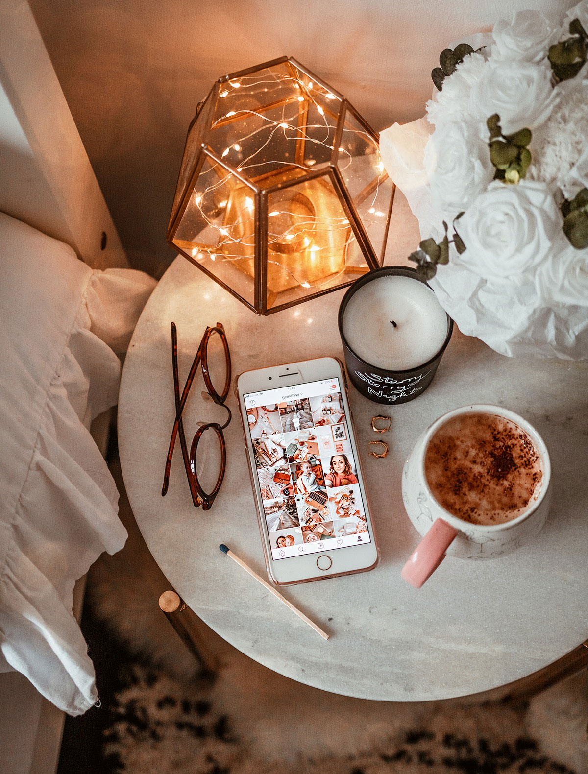
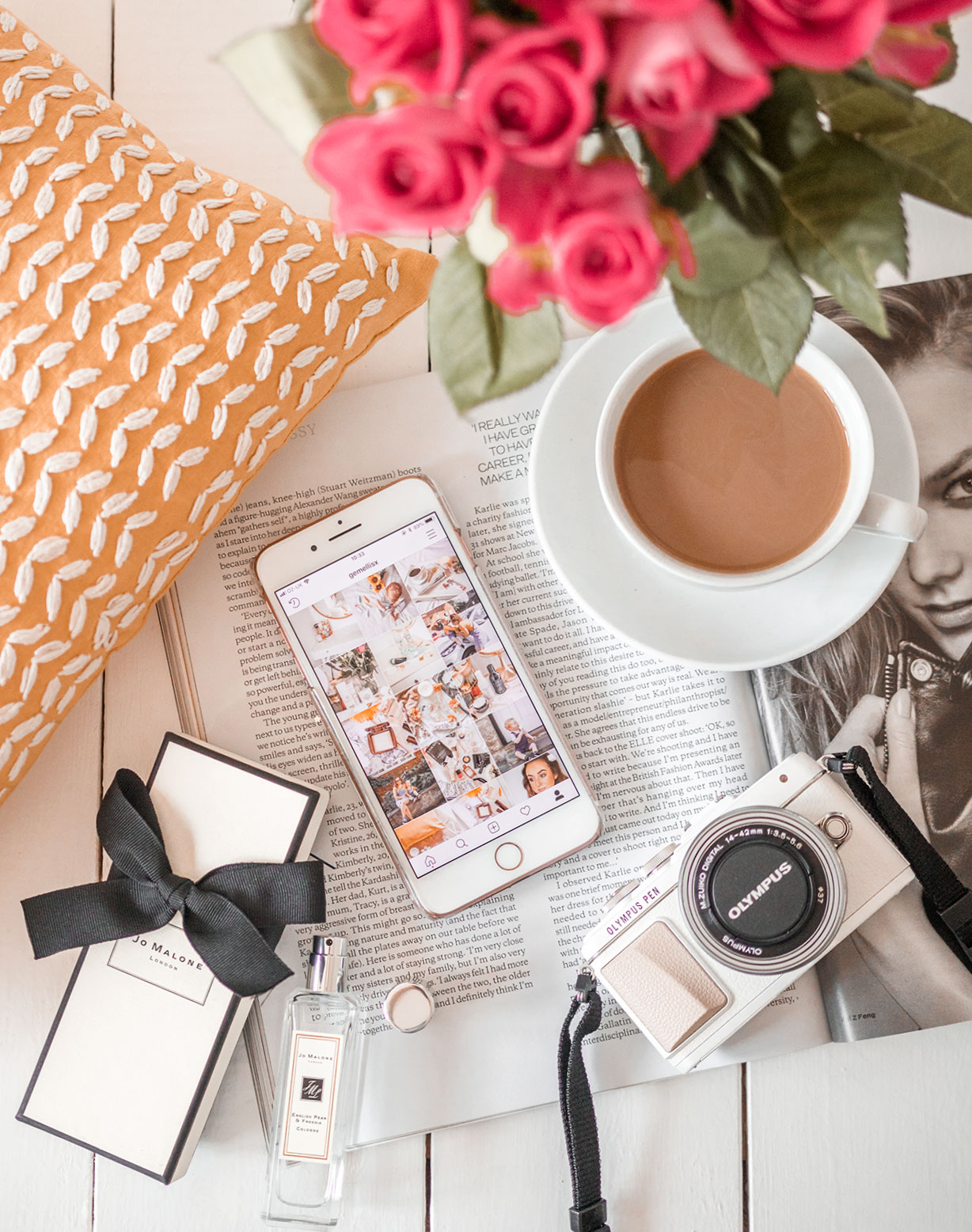
First of all, it helps to decide what kind of colour theme you want to go with. Now, this doesn’t mean you can only have one colour in every single photo you upload, it just means you pick a base colour for your photos. A lot of people like to go with a white base and then inject other colours into that. I personally like to go for a white background for the majority of my photos and I then inject a lot of pink into it. I’ve seen other themes with a lot of high contrasted photos and lots of black injected into them, some themes with a lot of greenery in them, as well as lots of blue for a more lifestyle based grid. I mean of course, you can mix and match and not stick to a colour, but I find injecting lots of pink into mine is just how I like it, keeps it girly and cute without being over the top.
Instagram Grid: Tone
One of the key aspects to a pretty Instagram grid is picking a tone. Do you want a warm or cool tone? Cool tones are blue based and generally have a more white/grey vibe to them. Warm tones are orange based and are generally a lot more vibrant. I personally prefer a warm tone as it makes the colours more saturated, brighter and gives a summery, sunlit effect. I used to have a cool toned theme but it just wasn’t working for me, especially with posting a lot of pretty pink, rose gold beauty products. They just didn’t have their ‘true’ colouring and I didn’t like that. Whichever tone you decide to go for, I’m sure it will look fab, I follow a few accounts with cool tones and they really make it work, their grids look beaut.
Instagram Grid: Depth
Do you want your photos to be bright & cheery or dark & mysterious? Again, I follow a variety of accounts with both kinds and both look lovely. I obviously have a preference for my own theme, but it doesn’t mean I don’t like the other. I’m all about those white backgrounds, warm tones and beautiful greenery and pinks so of course I opt for the bright & cheery aspect. The darker type usually involve things like brick walls, dark wooden tables, buildings etc. It actually looks really nice, I just don’t think it works for me and my photography style. I definitely think you need to work on which one you prefer though and stick to it to have a cohesive Instagram grid.
Filters
You don’t have to use a filter to make all your photos look the same, as long as you stick to reducing or enhancing certain aspects of the photo (for example; reducing or adding warmth) and stick to those same editing tools for every photograph you upload, then you should be fine. If you do want to use filters, that’s fine too, but just make sure you stick to the same one or ones that are very similar for each edit! I personally hardly use filters, I have no apps or anything, but I know a lot of people that do use them. If I use one, it’s usually just one from Instagram’s editing tools and I reduce the effect of the filter to something like 10% so it’s practically unnoticeable really. But being consistent with the way you edit is definitely a huge step towards creating a cohesive grid.
Style
Another way to keep your grid cohesive is to have a sort of ‘theme’ in the actual photographs themselves. So forget about all of the editing aspects for a while, and think more about your subject. Two of my favourite types of Instagram grids are makeup or anything beauty related, and babies. I tend to mix the two but I follow accounts that post such well styled photos of their children and have the nicest looking theme going. I also follow a LOT of beauty accounts and no two look alike, but each of them style their photographs so well that they all look amazing. There’s also other great accounts like ones that focus on fashion, interiors, cities, all kinds of things. You don’t have to stick to posting just one kind of subject, obviously, but it sure does make a beautiful looking grid. Another way you can style your photos is to have different subjects, but keep it cohesive by having a consistent prop or something along those lines. Some feeds have fresh flowers and other greenery in every single photo which looks gorgeous and makes the grid work together really well. You could also maybe use gold or rose gold props in all of your photos and that way you would then have the same sort of flow going. Just have a play and see what you can come up with that works for you!
So hopefully these tips help you a bit to curating your idea of the perfect instagram grid. I try and keep mine flowing nicely with the same editing tools and things but I’ll quite often post a photo that doesn’t fit in with it whatsoever, and that’s okay. I posted a photo just yesterday of Reuben & I in the countryside yesterday and the bright green background just doesn’t fit in with my grid whatsoever but it’s such a beautiful photo so I don’t really care! Sometimes there’s more important things in life than how great your Insta theme looks.