~ ADVERTISEMENT ~

Choosing the right prints for your home
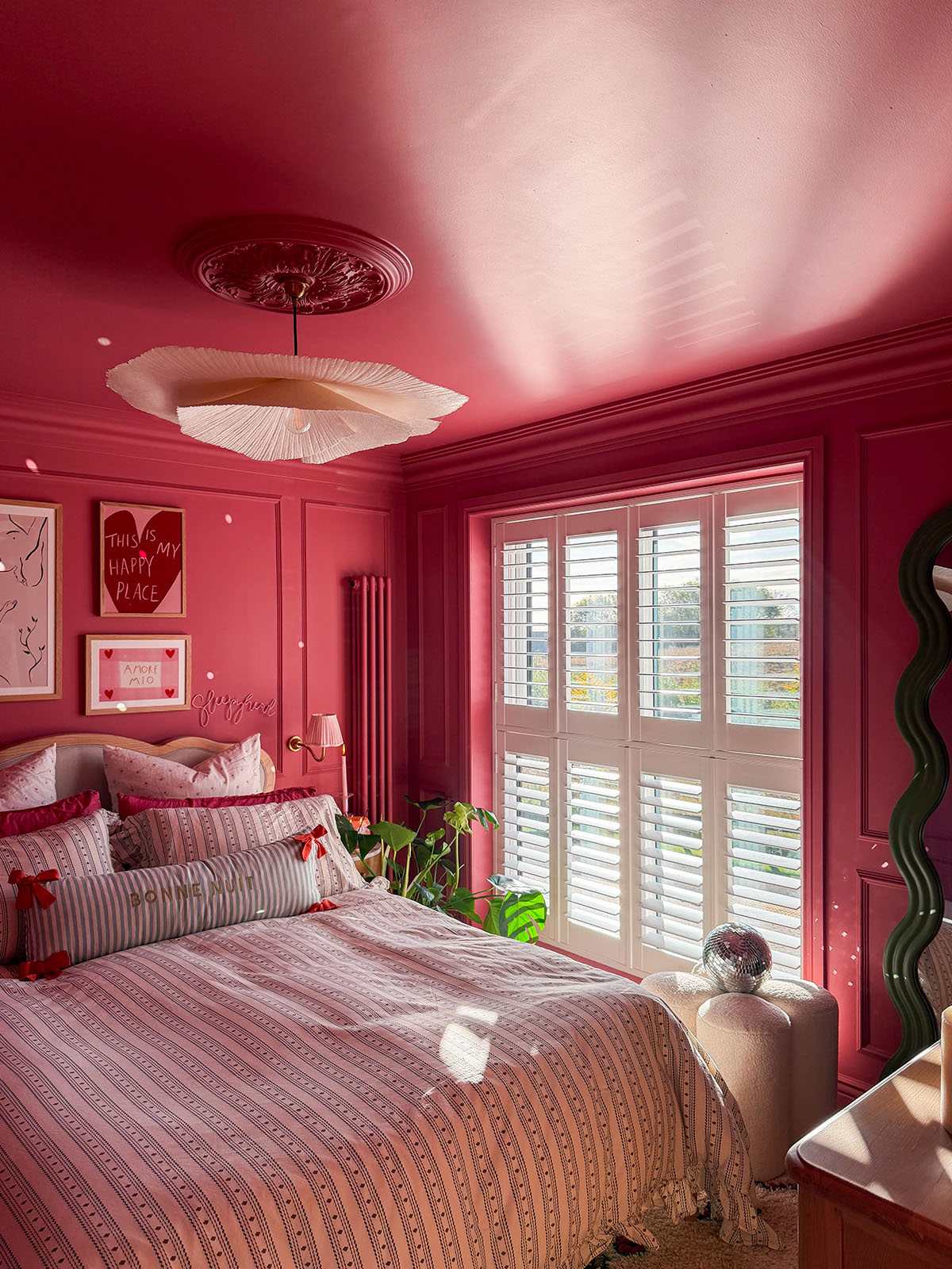
Choosing the right prints for your home is so important. If you read my blog regularly, you’ll know that I’ve worked with Desenio a few times now and my house is covered in their artwork. I’m literally addicted to the beautiful range of prints that they offer! I love that you can order them with the frames to save having to buy them separately too, it makes jazzing up the walls in my home super easy. I think a home can look so bare without artwork and decorated walls, particularly if your house is completely white like mine is. I’ve actually just made another Desenio order which should be on the way soon, I’m really excited as I’ve decided to revamp my bedroom and I’m going for a different style. However, for now, I will show you the pieces that were in my last Desenio order and share some tips and tricks for choosing the right prints for your home.

Start with colour
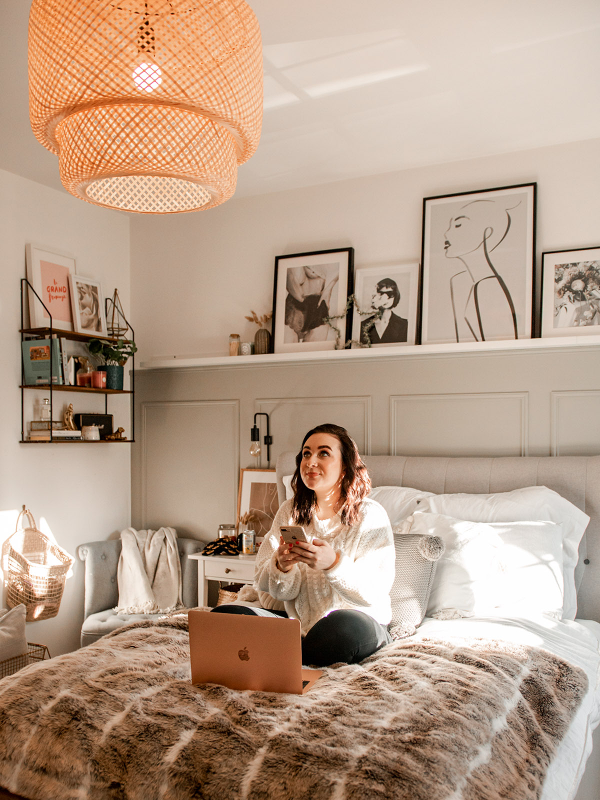
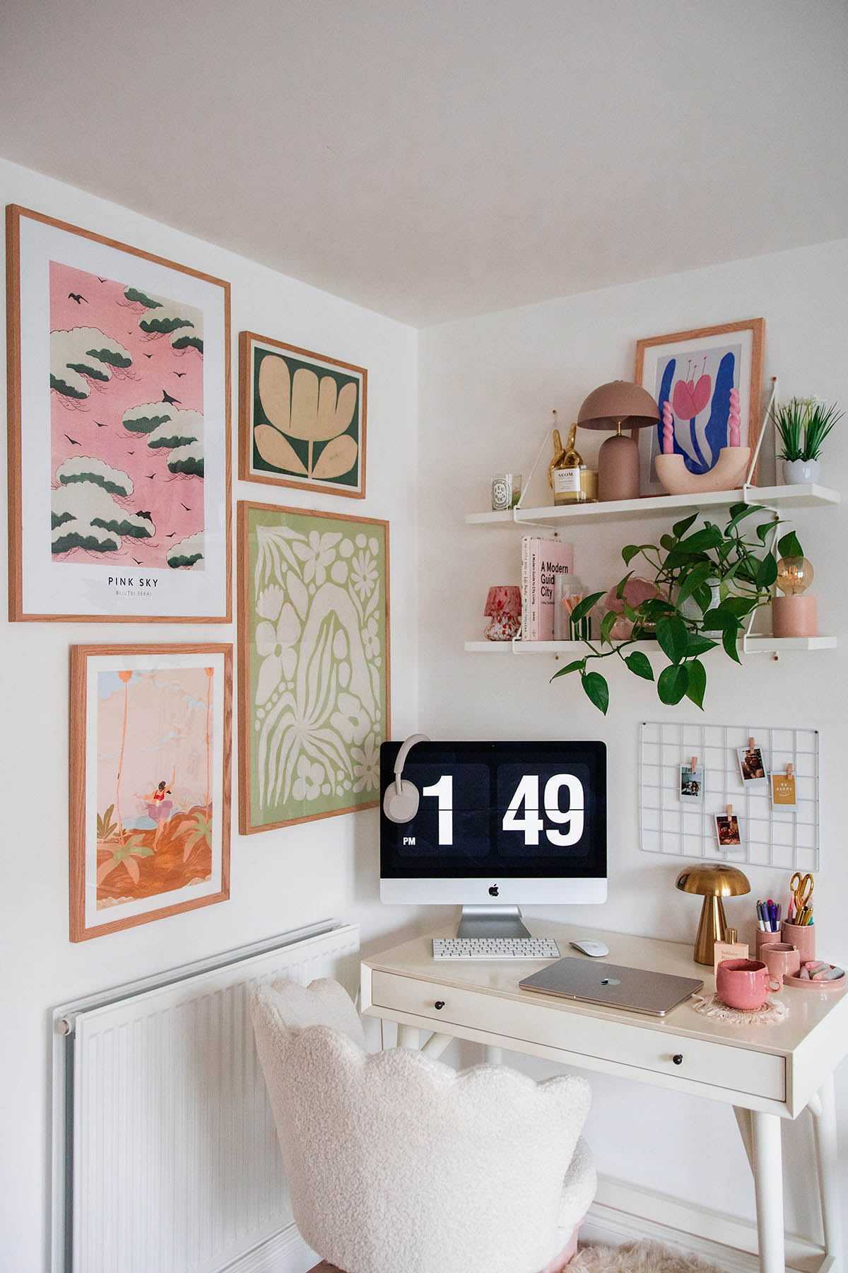
Like everything when it comes to home decor, I find the easiest place to start is to think about your colour scheme. I tend to choose prints that I know will fit in with the decor of the room already and that way I won’t have any regrets. In my bedroom I currently have lots of warm and light tones, and I wanted some prints to fit in with that. I opted for pinks and warm taupes because as you can see they fit in beautifully with the wall rail that I planned to put them next to. For this trio I chose the ‘Femme Study No2‘, ‘Bold Lines No2‘ and ‘Muted Rose‘ which I think work really well together. The same goes for the gallery wall in my lounge which is also from Desenio, the grey and neutral tones in there lead me to opt for a black and white theme and again, it turned out so well and fits in perfectly with the room decor.

Artwork first, frame after
A lot of people buy frames and then find prints for them afterwards, but I prefer to do the opposite. Artwork first, frames afterwards. I think that when you’re buying prints, once you’ve sussed out the right artwork for your walls, you pick the frames to go with the prints and not the other way around. It has always worked so well for me when doing it this way and I think it’s because the art is the main focus and you can end up with an odd colour scheme otherwise! If my artwork has a lot of contrast then I’ll most likely go for a darker, black frame… but sometimes if the print is too dark then it’s better to go for a lighter or white frame to balance it out. If a print is mostly white and light then I’ll definitely opt for a black frame because otherwise it doesn’t have enough definition to it. I used to only buy white frames but now I’m more into wood or black ones just because they add something more to a white painted wall, but ultimately it depends on the artwork first and foremost.


Size it right
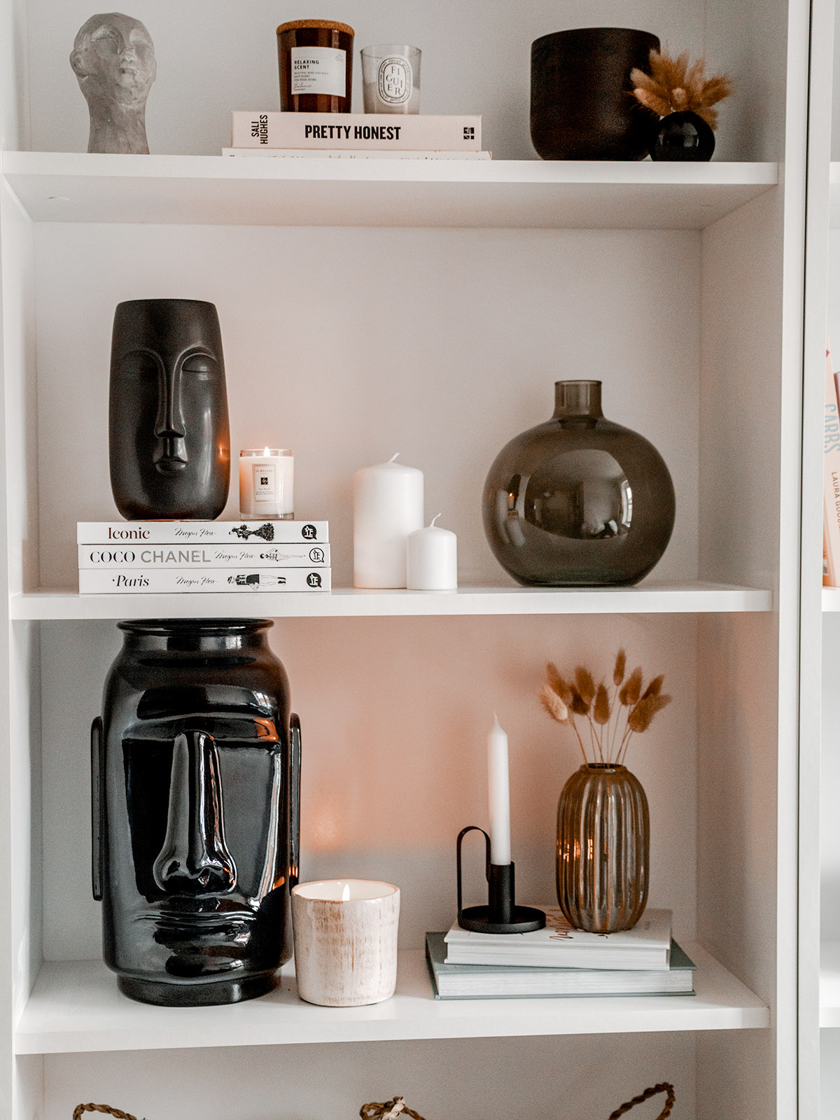
Getting the sizing right is particularly important if you’ve got a selection of frames together, or you’re creating a gallery wall. I think if you have a gallery wall of prints that are all the same size, it can look pretty good (my kitchen one for example if you follow me on insta) but I think that only works if you’re laying them out in a specific order/shape. For a gallery wall in general, I would always opt for different sized prints/frames. I just think it adds something more when you’re decorating your home, it has a little bit more character to it, if that makes sense. What I love to do is figure out the largest size that I would want, start with that one and then work around it. Desenio have a gallery wall creator on their website which is extremely handy for figuring out sizing and what is going to go where. I used it for the one in my lounge! The prints on my chest of drawers aren’t actually on the walls and they’re just leaning against them, but with this one I worked the sizes out based on what would look good stacked together, as well as making sure the front print wouldn’t affect the print behind. I’m changing these up now but I’ve loved these together for ages and hopefully I’ll find somewhere else to place them.

The artwork
Whilst I would first figure out my colour scheme (as mentioned above) I also think it’s really important to factor in what kind of art you want to see around your home. Don’t just pick any old thing you like the look of, go for things that intrigue you and inspire you. It’s so important to decorate your home with things that make it feel like a homely and safe space. For my bathroom I chose the ‘Dry Flowers‘ and ‘Abstract Reeds No1‘ prints because I wanted to inject some life into the space as it’s so small and quite dark in there. I think these worked wonderfully, as though they aren’t super bright prints, they’re photographs from outside and just give off a lovely warmth to this north facing bathroom! They just make the room feel a bit more welcoming.
Have you got prints in your home? What would your top tip for choosing the right prints for your home be?
Disclaimer: This post is a paid partnership with Desenio.